Published 2/2023
Created by Ameer hamza
MP4 | Video: h264, 1280×720 | Audio: AAC, 44.1 KHz, 2 Ch
Genre: eLearning | Language: English | Duration: 142 Lectures ( 4h 32m ) | Size: 1.43 GB
Master Matplotlib Anatomy and Learn Seaborn, Altair, Plotly, Streamlit, Dash, Pandas, Suitable for All Purposes
What you’ll learn
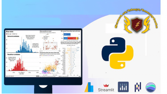
Review the python visualization landscape
Explore core visualization concepts
Use matplotlib to build and customize visualizations
Build and customize simple plots with pandas
Learn about seaborn and use it for statistical visualizations
Create visualizations using Altair
Generate interactive plots using the Plotly library
Design interactive dashboards using Streamlit
Construct highly custom and flexible dashboards using Plotly’s Dash framework
Data Analyst, data visualizations, Design interactive, developers, framework, libraries
Python, TalkPython, technologies, trainingtalkpy, Matplotlib, plotting
Requirements
Developers and Data Analysts that have some experience with python but have not developed a competency in a python visualization library
This course is also helpful for those that feel restricted by their current plotting tools and wish to explore other options.
All software used during this course, including editors, Python language, etc., are 100% free and open source. You won’t have to buy anything to take the course.
Description
COURSE IN THE NUTSHELLConcise and to the point, as I appreciate your time and don’t have the luxury to tell you my storyEasy to understand and tailored for a broad audience, as it only requires a basic knowledge of Python and onlyAboutHave you ever been confused by all the different python plotting libraries? Have you tried to make a “simple” plot and gotten stuck and been unable to move forward? Do you want to make sophisticated, interactive data visualizations in python? If you answer yes, to any of these questions, then this course is for you.What’s this course about and how is it different?The python data visualization landscape has many different libraries. They are all powerful and useful but it can be confusing to determine what works best for you. This course is unique because you will learn about many of the most popular python visualization libraries. You will start by learning how to use each library to build simple visualizations. You will also explore more complex usage and identify the scenarios where each library shines.By the end of this course, you will have a basic working knowledge of how to visualize data in python using multiple libraries. You will also learn which library is best for you and your coding style. Along the way, you’ll learn general visualization concepts to make your plots more effective.In addition to the overview material, we will cover some of the more complex, interactive visualization dashboard technologies.What topics are coveredIn this course, you will:– Review the python visualization landscape– Explore core visualization concepts– Use matplotlib to build and customize visualizations– Build and customize simple plots with pandas– Learn about seaborn and use it for statistical visualizations– Create visualizations using Altair– Generate interactive plots using the Plotly library– Design interactive dashboards using Streamlit– Construct highly custom and flexible dashboards using Plotly’s Dash frameworkWho is this course for?Developers and Data Analysts that have some experience with python but have not developed a competency in a python visualization library. This course is also helpful for those that feel restricted by their current plotting tools and wish to explore other options.Note: All software used during this course, including editors, Python language, etc., are 100% free and open source. You won’t have to buy anything to take the course.TELL ME MORE…After completing this course you will master Matplotlib on an intuition level and feel comfortable visualizing and customizing Matplotlib, Seaborn and Pandas charts of any complexities. More specifically, this course is a great resource if you are interested in:How Matplotlib WorksHow to create charts from simple to scientific ones with Matplotlib, Pandas and SeabornHow to customize charts of any complexities with easeTo achieve the objectives, I split this course into the following sections:Matplotlib AnatomyAs the name implies, in this section you will learn how Matplotlib works and how a variety of charts are generated.It gives you a solid understanding and a lot of aha-moments when it comes to creating and / or customizing charts that you haven’t dealt with before.Create 2D ChartsIn this section, you will generate plethora of charts using Matplotlib OOP, and Pandas and mix them together to achieve the maximum efficiency and granular control over graphs.Axes Statistical ChartsHere we will learn how to make statistical charts such as Auto Correlation, Boxplots, Violinplots and KDE plots with Matplotlib OOP and Pandas.SeabornSeaborn, a high-level interface to Matplotlib helps make statistical plots with ease and charm. It is a must-know library for data exploration and super easy to learn. And in this section, we will create Regression plots, Count plots, Barplots, Factorplots, Jointplots, Boxplots, Violin plots and more.Course Summary and ExercisesThis section has dual purposes.For one, it is a good summary of the course and provides you with exercises to test your knowledge and then provide solutions for comparison.Secondly, If you are short-on time, you can start here and then move to other sections if you seek more granular coverage of the topic or when you have more time available.TOOLS USEDDashStreamlitplotlyAltairMatplotlibSeabornPandas
Who this course is for
Anyone who wants to gain granular control over Matplotlib Charts
Anyone who wants to gain an intuition behind Matplotlib
Anyone who wants to learn to make a variety of charts with Matplotlib OOP, Seaborn and Pandas
Anyone who wants to learn to make a variety of charts with Altair, Plotly, Streamlit, Dash
Password/解压密码www.tbtos.com
转载请注明:0daytown » Complete Course on Data Visualization, Matplotlib and Python